Recent Articles
Design study: China Mobile’s connected campus
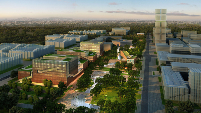
China Mobile—the world’s largest mobile communications company—is creating a new innovation campus in Beijing. When complete, the 215-acre campus will co-locate information collection, research and innovation, information services, international cooperation, exchange and display functions, food and entertainment and housing.
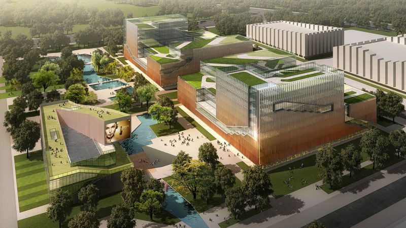
LEO A DALY’s design for Phase II encompasses 1.5 million SF of space for research and development, including three buildings in a park-like environment. The design explores multiple dimensions of connectivity—visual, experiential, cultural—to inform the building façade and its relationship with the occupied space while working with the master plan to ensure the project not only fits into the campus but also expresses the unique activities that occur within it.
Concept
After an immersion in the client’s work style, culture and aspirations, LEO A DALY and WDCE established a vision that grows out of China Mobile’s own goals: to create a comfortable, efficient and energy-saving work environment that emphasizes the concept of communication and connectivity in its programming and design. To achieve these goals, a series of indoor and outdoor spaces creates a highly engaged work environment with a unique image for each building
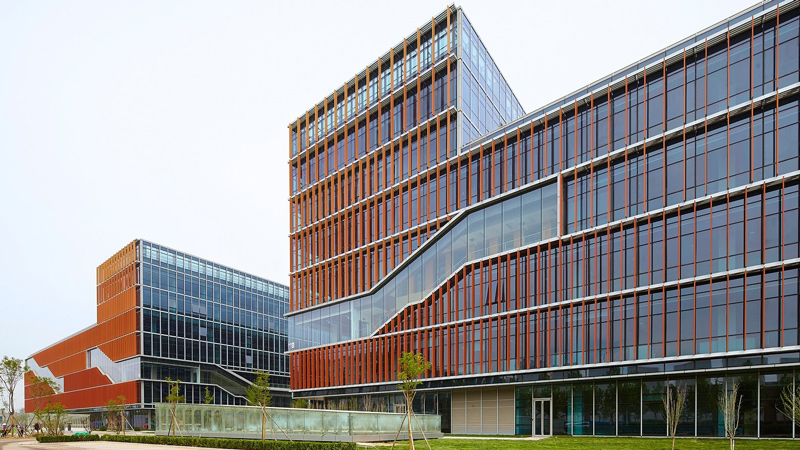
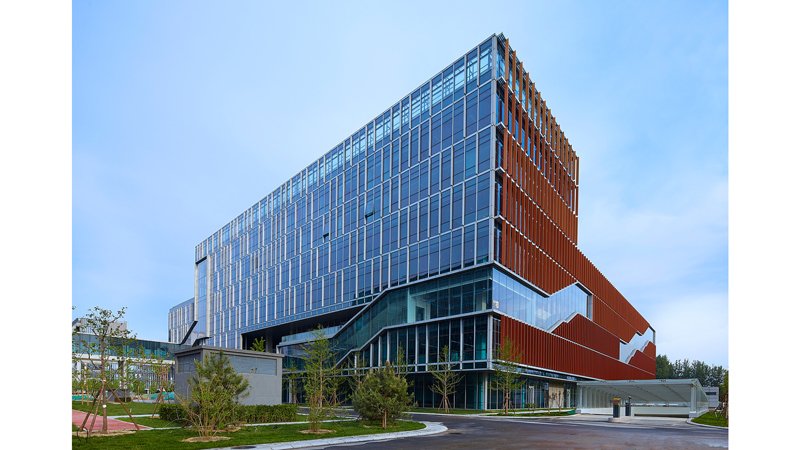
The fenestration’s copper brise-soleil graduates from dark at the bottom to light at the top, making an organic impression. Roofs provide planted inhabitable, sustainable landscape areas with grasses, plantings and man-made materials, including colorful rubber-based walking surfaces. The landscapes feature sculptural earth forms, fountains, terraces and gardens.
The public facilities building includes restaurants and café, museum spaces, a multi-functional hall, convenience shops, a bank and a book bar. While the design reflects the surrounding buildings, there is a greater emphasis on green and open spaces for the users.
Campus
Located in a suburban area of northwest Beijing, the 814,000-SF site is surrounded by mountains on three sides. Beijing’s climate is typical semi-humid continental monsoon climate with rainy, hot summers and cold and dry winters. The design should meet the following conditions: preventing direct exposure to sunlight in summer and receiving more direct sunlight in winter.
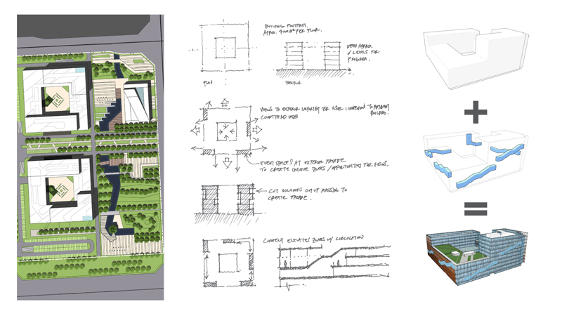
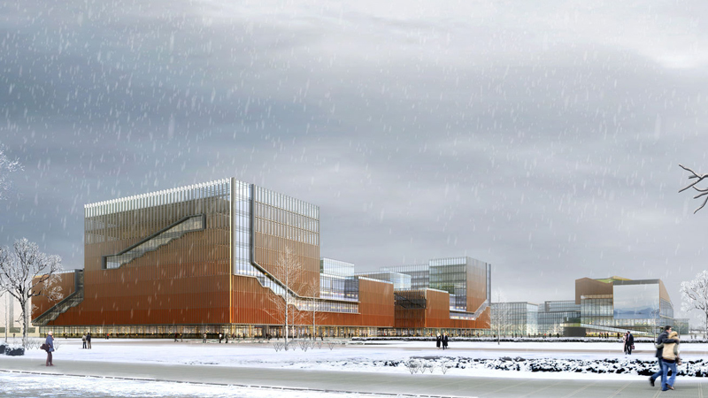
Phase II of the campus consists of two office buildings and a public facility building. Each sculpted block features façades that convey the dynamic activity within by way of large, diagonal windows. The windows reveal perimeter stairs, which act as impromptu gathering steps with excellent views to the landscape. Central to the design concept is taking conventional, internal stairways typically found in office buildings’ central core zones and placing them on the perimeter in which employees can take time to work alone or to meet with each other for planned or impromptu meetings.
Communication & Connectivity
In order to reflect China Mobile’s mission—“Communicating the World”—the design team arranged the program around several key themes: social value, responsibility, relationship, share, excellence and improvement. Applying these throughout the workplace resulted in four general spaces for the Information Port, referred to by the verbs Focus, Collaborate, Socialize and Learn.
The programming process engaged China Mobile to rethink how their teams use the workspace and to improve the layout depending on their unique needs. A survey was deployed to end users, measuring their satisfaction with the existing workplace and any goals/aspirations for the new space. Upon those spaces, the design team layered furniture and finishes to create spaces that are humane, comfortable, simple and green.
SOCIAL VALUE | RESPONSIBILITY | RELATIONSHIP | SHARE | EXCELLENCE | IMPROVEMENT
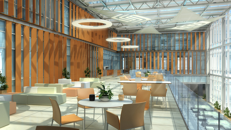
The first floor holds Socialize, Collaborate and Learn spaces, including a variety of informal meeting areas, conference rooms, lecture halls and training rooms. Focus space is distributed among the upper floors, where the workspace is easily secured without hindering staff movement. Each floor has Socialize space along a window wall, either looking into the courtyard/atrium or over the campus. The third floor, with a skywalk to connect the two buildings, features the most Socialize space, including a restaurant for staff and executives.
Floors 2–5 feature mostly open-layout workspaces, while executive offices are located on floors 6–9 in towers that rise above the base. The sixth and seventh floors function as smaller conference centers, creating an alternate location to the first floor and still within the secured zone. These floors feature landscaped terraces with seating options to enable meetings or independent work.
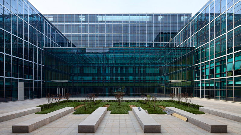
The open workspace takes advantage of the hollow center to bring daylight to all staff members. Depending on the department—the work of some groups is more collaborative than others—a variety of Socialize spaces are spread throughout the floor plate. With minimal structure running through the floor plate, the departments were able to customize their layout using pre-selected furniture. This creates a consistency in the design and modules without limiting the departments’ work styles. Circulation paths run through the floorplate and end at the window wall.
Taking the program and designing from the inside-out, the façade exposes circulation patterns and communication opportunities offered within the building. Communicating stairs push out of the form, emphasizing the vertical connections at various points of the building. These stairs offer both the opportunity for staff to move between departments and to collaborate through informal gathering spaces built with the stairs. In this way, the building expresses its goal of enabling collaboration and communication to the outside, where one can see the form accommodate the purpose-built spaces. While occupying these spaces through the large landings or the deep benches, users look out onto the landscape, offering moments of respite during the workday.

